

Blending Warm and Cool Paint Colors Throughout Home


This is such an important question for every home decorator to answer. The short answer is yes, you can mix warm and cool colors in decor. But the trick is knowing how. Let's talk about how to mix warm and cool color and get it right!
We should back way up because there is a back story to mixing warm and cool colors when we decorate.
First of all, there are a few things you need to know and understand about warm and cool colors. And when you learn these things your decorating will look so pretty because of it!
Let's dig right in…
LET'S TALK ABOUT THE COLOR WHEEL
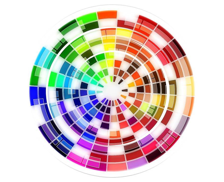
The color wheel is a complex device that organizes color in a wheel type shape showing colors relationship to each other.
For this post I'm using the color wheel to illustrate two important things…
- the warm colors on the color wheel
- and the cool colors on the color wheel
The color wheel is basically broken down into warm and cool colors.
A great example in nature of a warm and cool color spectrum is a rainbow.
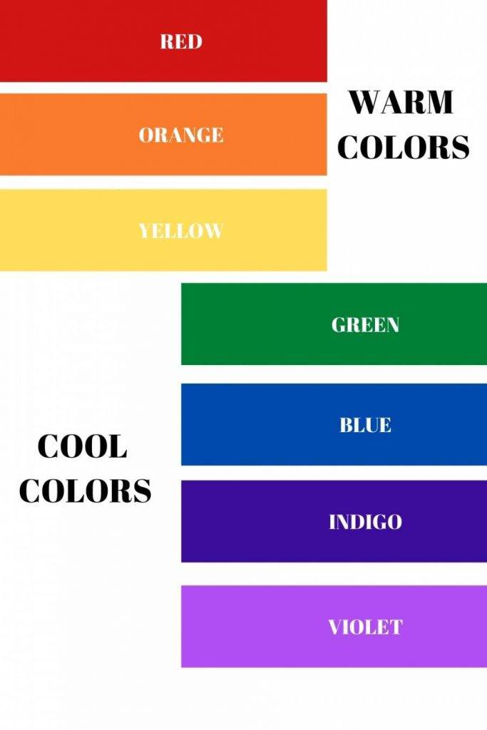
WARM COLORS
The right side of the color wheel is where the warm colors live.
Colors like red, orange, and yellow are all warm. Also neutrals like beige and tan, but not always. I'll explain later.
Warm colors evoke a cozy and comforting feeling. These colors are welcoming and can make us feel energized and upbeat!
COOL COLORS
Cool colors live on the left side of the color wheel.
Colors like purple, blue and green are all cool colors. Gray is often but not always a cool color. I'll talk about that later too.
Cool colors tend to make us feel relaxed and serene. They make us feel calm.
It's important to know what colors in their most pure, saturated form are either warm or cool.
Here's something interesting you probably already know…
Red, blue and yellow are primary colors and all colors on the color wheel are created by mixing red, blue, and yellow together.
White is the mix of all colors. And black the absence of color. Just so you know.
Are you with me so far?
MASS TONE AND UNDERTONES
Color has mass tones and undertones.
Understanding these terms you will start to crack the color decorating code! And it will help you mix warm and cool colors when you decorate!
WHAT ARE MASS TONES?
A mass tone is the first color you see when you look at a color.
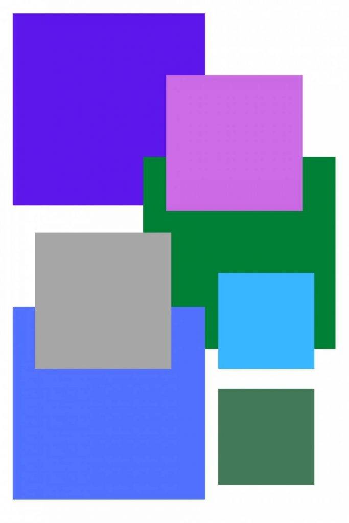
Here's an example
Without any thought say the color of the blocks below…
Going from top left to bottom right you might say blue, blue, red, pink, yellow, yellow.
The first color you see is the MASS TONE.
Most of us who are not color blind can easily see mass tones. They are easy to figure out most of the time. Maybe the pink and light yellow are a bit harder. So if you said red or beige you are still right!
We can figure out whether a color is warm our cool by looking at its mass tone.
We just have to think about our color wheel or the rainbow to know the mass tone.
UNDERTONES AND HOW THEY AFFECT COLORS
While mass tones are easy to see, undertones are not often apparent at first glance. And even with a bit of inspection, they can still be hard to figure out.
These undertones can be especially difficult to ferret out when working with neutrals and whites. But that is for another post.
Since all colors are made by combining red, blue, and yellow the ratio of the colors mixed together to make a new color becomes very important.
Stay with me. Let's take blue for example…
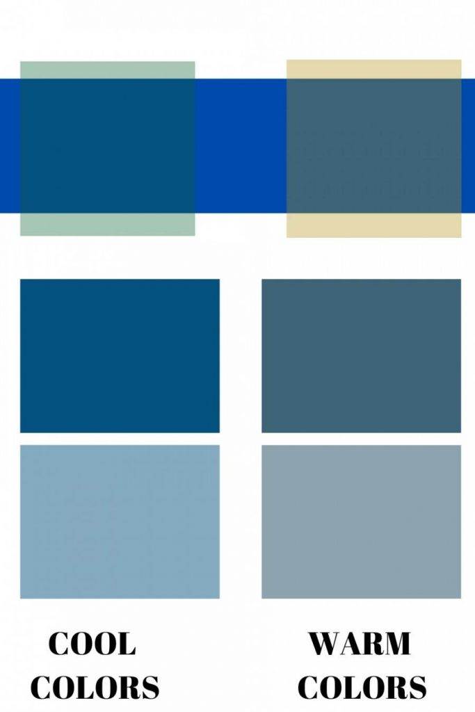
The color at the top of the infographic is a true primary blue.
I overlayed a Kelly Green (cool color) in a weak saturation and then an even weaker saturation to show you what a cool undertone would do to the primary color blue.
And I did the same using yellow in a weak saturation and an even weaker saturation to produce two warmer shades of blue.
Blue is still a cool color no matter what the undertones, but the undertones can make blue feel a little warmer or cooler.
With a little practice, you can figure out the warm or cool undertones of any color.
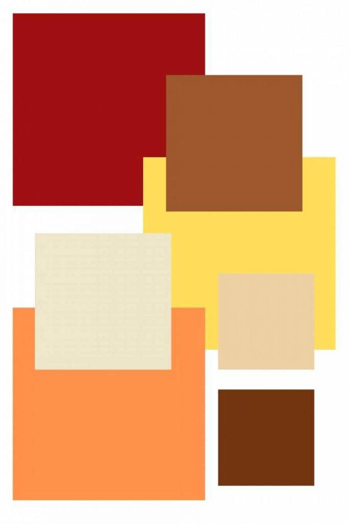
ANOTHER UNDERTONE EXAMPLE
Color theory plays a very big role in the beauty and cohesive look of a room.
It's important to choose colors that work together and don't fight one another. If your room is just not coming together the way you thought it would it's probably the undertones that are not playing nicely together.
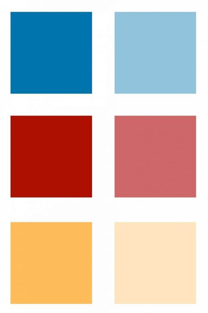
Here's an easy way to see what the undertones in a color are.
Hold a color up to its truest color. The truest red, or yellow or blue or green, or purple. Think of the eight colors in a box of crayons.
Then you should at least be able to tell if the undertones are warm our cool.

The center colors in the infographic above are the truest blue, green and red. The left color blocks are warmer because they move toward the warmer side of the color spectrum.
The color blocks on the right side of the infographic are cooler versions of the true color because they move towards the cooler side of the color spectrum.
Look at the red blocks…
The more yellow (warm color) added to true red the color begins to be a tomato red and will eventually be orange.
The more blue (cool color) added to true red the more magenta and eventually purple it will become.
CAN YOU MIX WARM COLORS AND COOL COLORS WHEN DECORATING?

The answer is a resounding YES! However knowing the right mix is crucial.
Combining warm and cool colors in a room keeps the room interesting. However you should strike a balance between the two.
Here's an easy way to mix warm and cool colors so a room is interesting…
WALLS AND BIG FURNISHINGS
This is a super easy way to mix warm and cool colors. It is not detailed or does not go into color theory in depth but it is a good rule of thumb for the home decorator.
Your walls and big items in your room should all be warm or all cool. Don't mix these unless you have a trained eye or are a color theory savant!
I hear from so many unhappy decorators because "something is not right" with a room.
They have pretty furnishings but their undertones fight!
Super simple solution. Keep walls and big items in the room either warm or cool.
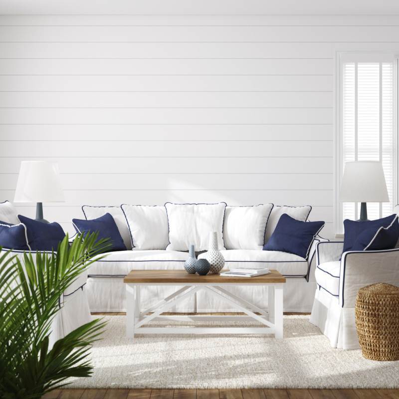
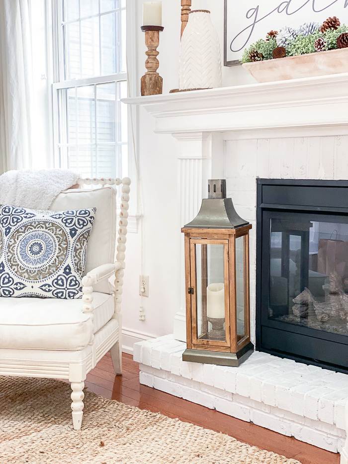
My home is full of warm-toned neutrals and creamy whites. All the walls and foundation furnishings also have warm tones. So my mass tones and undertones all work together!
ADDING OPPOSITE UNDERTONES FOR INTEREST
Once all the big items in a room are happily working together it is now time to add a bit of interest and good tension to a room by adding in a bit of the opposite undertone.
Decorating with a bit of opposite colors and undertones create interest in a room. Adding both warm and cool colors creates this fantastic thing called tension!
Think of a violin. When the tension on the strings are just right they play a beautiful song!
Same in decorating. We need to strike the right tension between warm and cool colors and undertones to create beauty too!
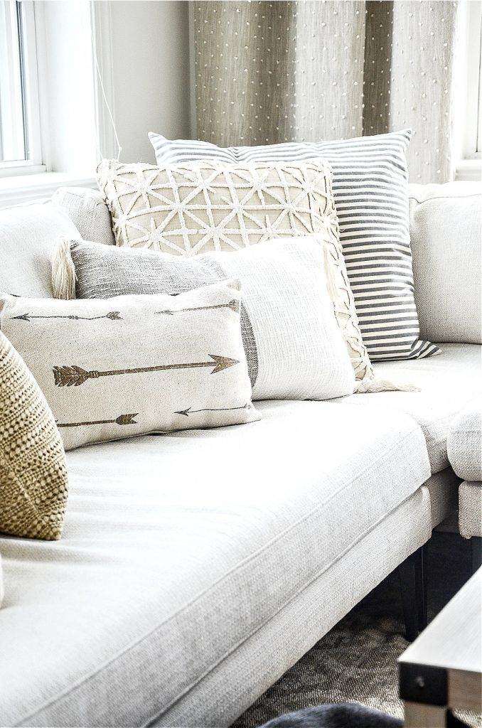
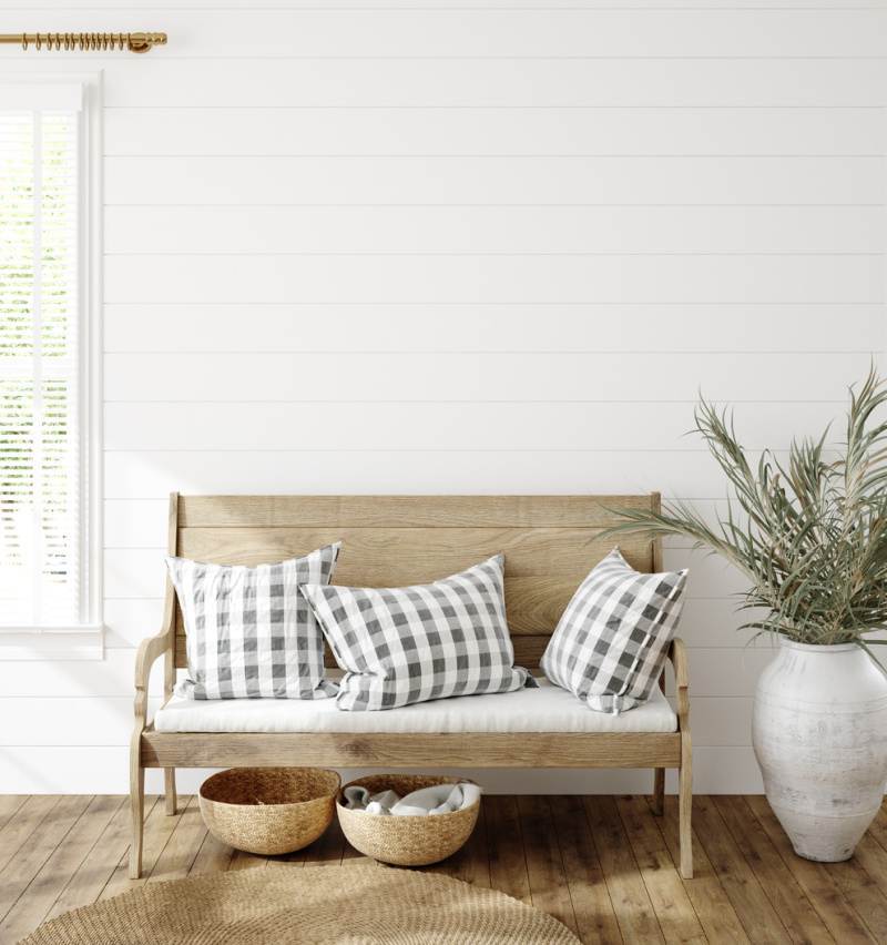
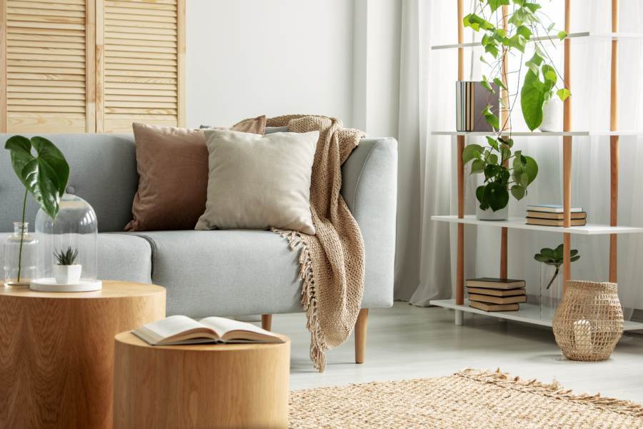
My favorite way to do this is to add a mix of warm and cool pillows to my sofas or chairs.
Another way to mix undertones is through accent chairs and accessories.
This little stylized floral chair is a great example of cool and warm colors mixing together to create a nice balance.
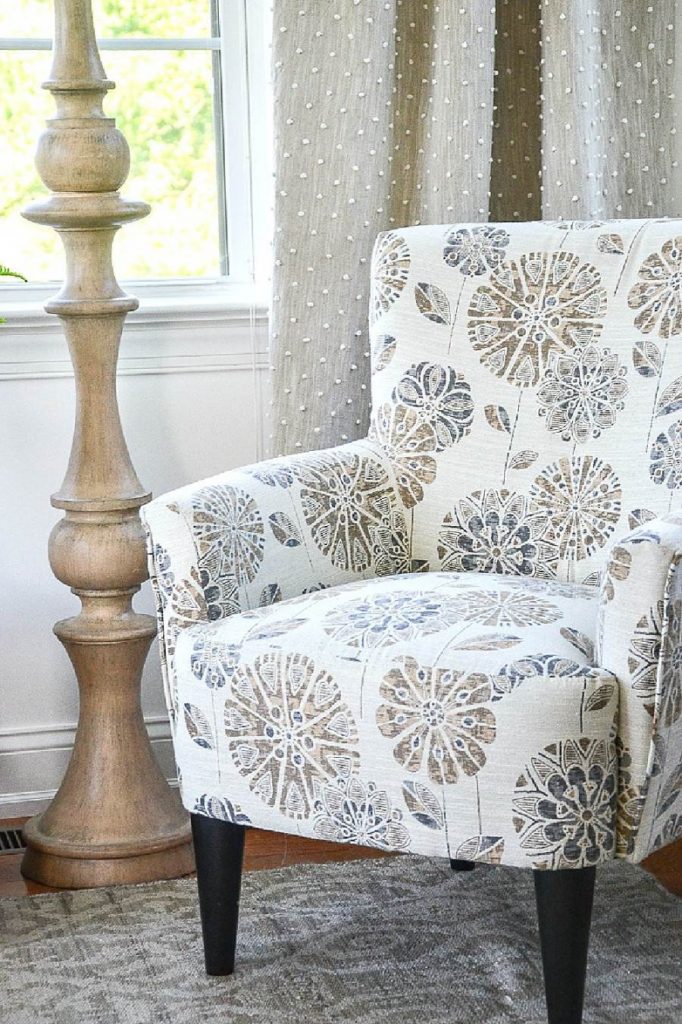
It is such a versatile chair that it has found a home in a couple bedrooms, my office, and my sunroom. It has just enough warmed up gray (remember that gray is still a cool color no matter how warmed up it is) to make all the warm tones in my home come alive!
For me, gray is a hard color to live with if it is used as a mass tone in a room. It's too cold and impersonal. Do you see how color can affect you and me? You may love gray and warm neutrals may overstimulate you! Color is an amazing thing, friend!
However, gray is a wonderful accent color for my warm-toned home! It wakes up the colors in a room and makes it interesting.
A great example of this warm/cool tone balance is in my dining room.
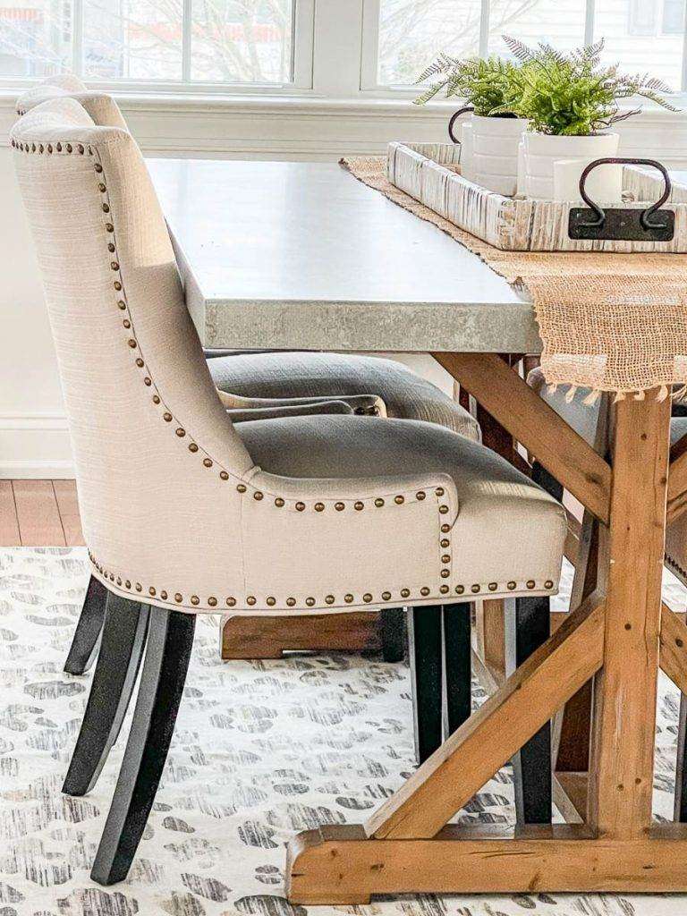
There are a lot of warm tones going on in here.
The soft gray of the concrete top of my table works to bring in a balance of warm and cool.
Did you notice how warm the concrete is even though it is still a cool color? If the tabletop was too cool and icy it would not have worked at all.
PRACTICE FINDING UNDERTONES IN YOUR HOME
When a room in your home seems "off" but you don't know why it might be the undertones! They play a very big role in creating beauty, interest, and cohesiveness in any room in your home.
So practice finding the mass tone and the undertones in your furnishings. And follow all these easy tips for creating harmony in your home.
YOU MIGHT ALSO LIKE
Here are a few post you might like. They are all about important design concepts to know to create a beautiful home.
ELEMENTS OF DESIGN… COLOR
RHYTHM IN DESIGN
ELEMENT OF DESIGN, SPACE
FOCAL POINT TIPS FOR A BEAUTIFUL ROOM


Blending Warm and Cool Paint Colors Throughout Home
Source: https://www.stonegableblog.com/can-you-mix-warm-and-cool-colors-in-decor/#:~:text=The%20answer%20is%20a%20resounding,a%20balance%20between%20the%20two.
0 Response to "Blending Warm and Cool Paint Colors Throughout Home"
Post a Comment